- BY Kevin Barry BSc(Hons) MRICS
- POSTED IN Latest News
- WITH 0 COMMENTS
- PERMALINK
- STANDARD POST TYPE

How my father’s lighthouse keeper legacy gave me the perfect blueprint for building an iconic brand identity
When Phil Knight paid a graphic design student $35 for what would become the world’s most recognizable logo, he had no idea he was creating a symbol worth $26 billion today. The Nike swoosh didn’t become iconic overnight—it evolved through strategic thinking, consistent application, and perfect timing.
As a quantity surveyor building my own business, I’ve been studying that same strategic approach. But what I discovered surprised me: my path to brand recognition doesn’t require hiring expensive designers or complex market research. The perfect symbol for my business has been sitting in plain sight, rooted in my family history.
My father was a lighthouse keeper. That heritage has become the foundation of my brand strategy.
The Swoosh Strategy: Lessons from a $26 Billion Logo
Nike’s transformation from “Blue Ribbon Sports” to a global icon offers practical lessons for any business owner. The swoosh succeeded because it embodied several key principles:
Simplicity Creates Recognition
The swoosh uses a single, clean shape that’s instantly memorable. Nike discovered that minimalist design provides incredible flexibility—the logo works equally well on shoes, billboards, or digital screens. This simplicity eventually allowed Nike to drop their company name entirely, confident that the symbol alone would communicate their brand.
Strategic Timing Matters
Nike didn’t rush into standalone logo usage. They spent years building recognition with combination branding (swoosh + company name) before making the bold move to let the symbol stand alone. This patience paid off—by the 1990s, everyone knew what the swoosh represented.
Emotional Connection Drives Loyalty
Nike’s success isn’t just about athletic performance—it’s about tapping into personal motivation. The swoosh became shorthand for pushing limits and taking action.
Why My Father’s Lighthouse Works as a Business Symbol
When I first considered incorporating a lighthouse into my branding, I wondered if it might seem disconnected from quantity surveying. But the more I thought about both my father’s work and my own, the more the connection made sense.
My father spent his career guiding ships safely to shore, monitoring conditions and warning of hazards. I guide construction projects to completion within budget, monitoring costs and identifying financial risks before they become problems.
The lighthouse represents core aspects of what I do:
Navigation Through Complexity: Ships need guidance through difficult waters; construction projects need guidance through complex financial landscapes.
Reliability Under Pressure: Lighthouses work regardless of weather conditions; quantity surveyors need to deliver accurate cost management even when projects face challenges.
Early Warning Systems: Lighthouses prevent disasters by identifying hazards; I prevent cost overruns by spotting budget risks early.
Clear Communication: Lighthouse signals are unambiguous; my cost reports need to be equally clear and actionable.
My Three-Phase Lighthouse Strategy
Drawing from Nike’s approach, here’s how I’m building my lighthouse brand identity:
Phase 1: Foundation Building (Current)
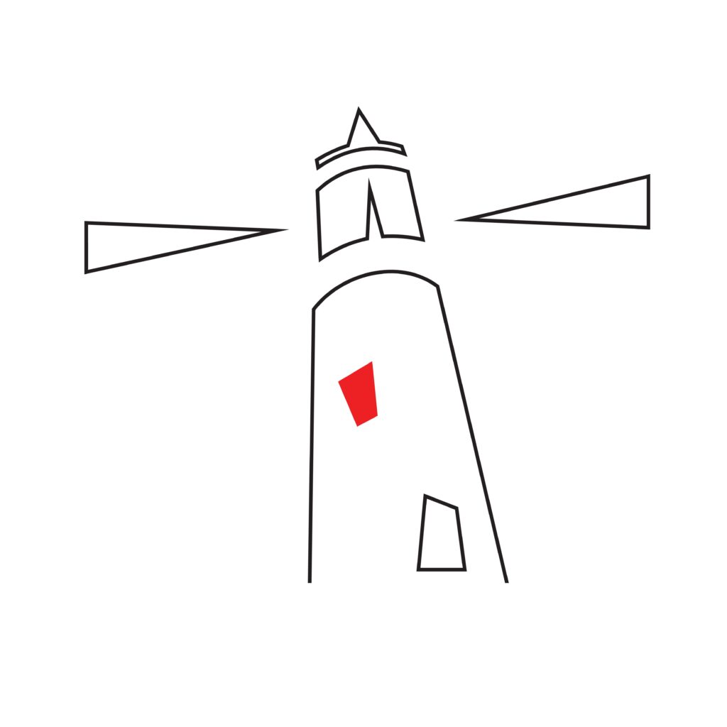
I’m maintaining my existing imagery while gradually introducing the lighthouse symbol. It appears on business cards, email signatures, and website headers alongside my company name.
The focus is building recognition while establishing the connection between lighthouse guidance and quantity surveying services.
Phase 2: Symbolic Integration (Next 12 Months)
I’m developing consistent lighthouse messaging across all communications. The goal is to position myself as the reliable guide that helps construction projects reach completion safely within budget.
I’m creating simple, versatile lighthouse designs that work across different formats—from letterheads to presentations—while testing taglines that connect the metaphor to practical services.
Phase 3: Strategic Evolution (Years 2-3)
As recognition builds and clients start associating my lighthouse symbol with quality quantity surveying, I can reduce reliance on text-heavy branding. I’m tracking how clients respond to the symbol, preparing to let it carry more brand weight over time.
My Competitive Advantage
In quantity surveying, differentiation often comes through personal connection and demonstrated reliability. My lighthouse keeper heritage provides both.
This isn’t borrowed imagery—it’s documented family history. The authentic connection between my father’s work and mine creates a memorable narrative that sets me apart from competitors using generic corporate imagery.
The business logic is straightforward:
- Authentic storytelling: Real family history resonates more than manufactured brand stories
- Professional relevance: The lighthouse metaphor aligns directly with quantity surveying functions
- Memorable differentiation: Unique imagery creates instant recognition
- Trust building: Clients understand the symbolism and connect it with reliability
How I’m Implementing This Strategy
Year One (Current): Introducing lighthouse imagery alongside existing branding. Using combination branding to build recognition without confusion.
Year Two: Developing comprehensive brand guidelines and messaging that consistently connects lighthouse metaphors to quantity surveying expertise.
Year Three and Beyond: Assessing market recognition and gradually reducing text dependence as the lighthouse symbol gains independent strength.
A Family Tradition That Continues
My father guided ships safely to shore from his lighthouse. My brother continues our family’s maritime connection through his work with the RNLI, helping rescue people in distress at sea. I guide construction projects through complex financial waters to successful completion.
As my three children grow, I’m curious whether any will find their own way to continue this pattern—perhaps as engineers, project managers, or in other roles focused on keeping people safe and projects on track.
It’s not about sentiment—it’s about recognizing that my family has consistently chosen work focused on guidance, safety, and helping people reach their destinations successfully. That’s exactly what clients need from a quantity surveyor.
Long-Term Vision
Like Nike’s swoosh, I want my lighthouse logo to eventually function as a standalone symbol of trusted guidance in construction cost management. The goal is for clients to see the lighthouse and immediately think of reliable, accurate quantity surveying backed by a family tradition of professional guidance.
This isn’t about copying Nike’s strategy—it’s about adapting their proven principles to my specific situation. I have something Nike had to create from scratch: an authentic story connecting family heritage to professional mission. Plus, mine doesn’t require a multimillion-dollar advertising budget to make sense.
The Bottom Line
I’m not just building a brand—I’m leveraging a genuine competitive advantage. My lighthouse represents continuity, reliability, and professional guidance backed by family history.
My father’s lighthouse guided vessels safely to port. My lighthouse brand will hopefully guide my quantity surveying business to sustainable success, one well-managed project at a time.
