- BY Kevin Barry BSc(Hons) MRICS
- POSTED IN Latest News
- WITH 0 COMMENTS
- PERMALINK
- STANDARD POST TYPE
What the Strangford Lough Crossing Traffic and Diversion Heatmap Shows
A plain-language guide for the general public and elected representatives
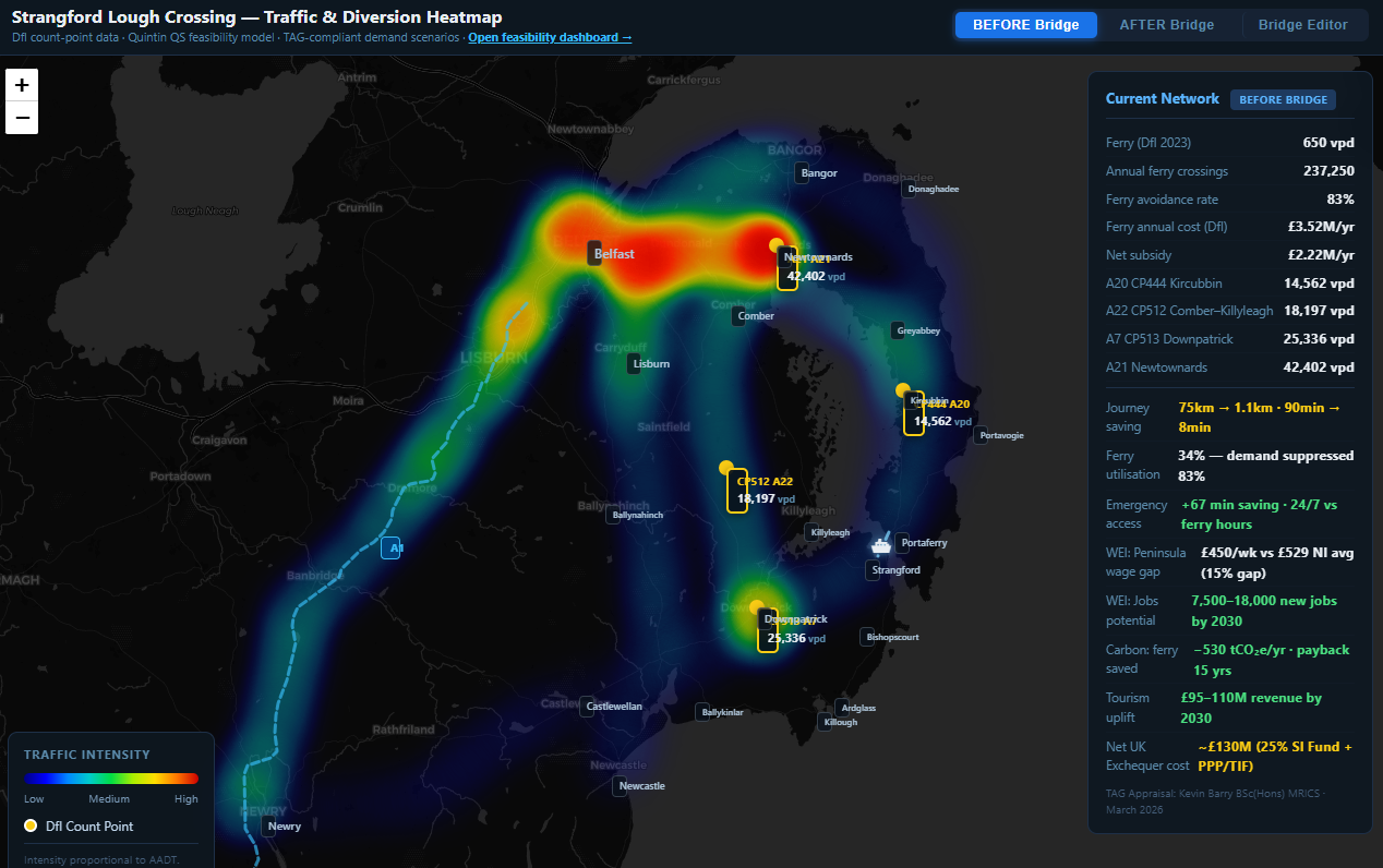
The heatmap is an interactive map of the roads around Strangford Lough. Each road is coloured by how many vehicles use it every day, measured in Vehicles Per Day (VPD), also known as the Annual Average Daily Traffic (AADT). The colour shifts from cool (blue/purple, low traffic) through to warm (orange/red, high traffic). The map can be toggled between “Before Bridge” and “After Bridge” to show how traffic patterns would redistribute if a fixed crossing were in place.
All underlying figures are sourced from DfI Traffic Count Point data, Freedom of Information disclosure DFI-2024-0366 (DfI Finance Directorate, 9 October 2024), FOI disclosure DFI-2024-0412 (Mark McPeak, 7 August 2024), and the Quintin QS TAG-compliant demand model (March 2026), as published at ktb-slc-heatmap.netlify.app.
Reading Each Band
0 VPD — No Traffic / Baseline Zero
This represents the Strangford Ferry itself in its current state. The ferry carries approximately 650 vehicles per day (DfI Traffic Count Point data, 2018 to 2023, as cited in the Strangford Lough Crossing Campaign Briefing Document to Chris Hazzard MP, 13 March 2026). On the heatmap, 650 VPD is so low relative to the surrounding road network that it registers at the coolest end of the colour scale — effectively invisible when compared to the roads on either bank. This is the starting point: a crossing that the heatmap treats as carrying almost nothing.
Up to 4,000 VPD — Low-Demand Local Roads
Roads at this level are lightly used rural or local distributor roads. On the heatmap these appear in cool blue tones. These are typically the minor approach roads feeding the ferry slipways, or secondary routes on the Ards Peninsula. At this level, a road is well within its capacity and causes no measurable congestion. The bridge, at even its most pessimistic demand scenario, would not remain in this band for long.
4,000 to 8,000 VPD — Emerging Demand
This band represents the lower end of what the Quintin QS central demand model projects for a new crossing in its opening years, and also corresponds to the HITRANS Corran Narrows reference class cited in the model. The Corran Ferry in the Scottish Highlands recorded approximately 750 VPD before its fixed link study (HITRANS Corran Narrows Fixed Link Feasibility Study, Stantec UK/COWI, 2023, held in the Strangford Lough Crossing Campaign project archive). Roads in this band on the heatmap begin to warm in colour. The map shows that roads currently bypassing the Lough — notably the A22 at DfI Count Point 512, recording 18,197 VPD, and the A7 at Count Point 513, recording 25,336 VPD — carry substantially more traffic than a new crossing would likely attract in its early years, confirming that significant demand is already present on the network, routing the long way around.
8,000 to 12,000 VPD — Mid-Range Traffic
This band is where the “Before Bridge” heatmap shows the A20 coastal road at DfI Count Point 444, recording 14,562 VPD. These roads appear in amber tones. A bridge in this range is a functioning, well-used piece of infrastructure by any standard comparator measure. The Quintin QS central Year 5 demand scenario projects the crossing reaching approximately 14,100 VPD within five years of opening — placing it firmly within this band and directly comparable to the existing A20 flow at Portaferry.
12,000 to 16,000 VPD — High-Use Arterial Traffic
Roads in this band are substantively loaded. The A20 at Count Point 444 (14,562 VPD) sits within this range. On the heatmap “After Bridge” toggle, the warm colouring on the round-Lough roads softens as some traffic transfers to the direct crossing, while the bridge itself moves into this band. The map illustrates what transport planners call “network relief”: traffic that currently travels 30-plus miles around the Lough shortens its journey, reducing pressure on the long-route roads.
16,000 to 20,000 VPD — Busy Regional Road
The A22 at Count Point 512 (18,197 VPD) sits in this band and appears in warm orange on the “Before Bridge” map. This is a busy regional road. The heatmap uses this count point as an anchor to show that the demand for travel across the Lough already exists; people are already making this journey, using a road that adds approximately 30 miles. A crossing capturing even a fraction of this diverted traffic would operate at a commercially and economically meaningful level.
20,000 VPD and above — High-Density Arterial / Design Capacity Upper Range
The A21 at 42,402 VPD is the highest-flow road shown on the heatmap and appears in the deepest warm tones. The heatmap notes the bridge design capacity at this upper range. This is not a projected demand figure for the crossing — it is the structural and operational ceiling. The significance of including this figure is to demonstrate that the bridge, as an engineering proposition, would not be stressed even at the highest realistic demand scenarios: there is headroom between likely demand and design capacity.
Two Break-Even Thresholds — and Why Both Are Honest
This is the most important section of the heatmap, and the one that has been most significantly developed in the updated version. Rather than presenting a single break-even figure, the heatmap now sets out two distinct thresholds, explains what each one means, and is transparent about where the ferry currently sits in relation to both. The four reference points are as follows.
| Threshold or Reference Point | VPD |
|---|---|
| TEE-only operational break-even | 285 vpd |
| Strangford Ferry (current daily average) | 650 vpd |
| Full Green Book BCR break-even (BCR = 1.0) | 5,000 vpd |
| Central demand scenario, Year 5 after opening | 14,100 vpd |
These four figures tell a coherent and honest story, which the heatmap sets out without overstatement. Each is explained below.
The TEE-Only Break-Even: 285 VPD
TEE stands for Transport Economic Efficiency. It is the first layer of benefit that transport appraisal calculates under the Department for Transport Transport Analysis Guidance framework, and it covers the direct, measurable savings to road users: time saved on each journey, fuel saved by not driving 30 extra miles around the Lough, and fares no longer paid to the ferry. These are real, quantifiable savings that accrue to every driver who uses the crossing instead of the long road route.
The TEE-only break-even of 285 VPD means that at 285 vehicles per day, the monetised value of those direct user benefits — time savings, vehicle operating cost savings, and released ferry fares — equals the annualised capital and operating cost of the crossing under a standard 60-year appraisal, using HM Treasury Green Book discount rates and DfT TAG values of time.
In plain terms: at 285 vehicles per day, every driver using the bridge is already saving enough time and fuel money, in aggregate across all users, to justify the cost of building and running it — purely on the basis of what it does for the people who cross.
The ferry currently carries approximately 650 VPD. That figure already exceeds the TEE-only break-even by more than double, before a single additional vehicle is induced onto the network.
The Honest Intermediate Band: 285 to 650 VPD
The heatmap is explicit about what this band means. If the crossing were to attract only the traffic currently using the ferry — 650 VPD — and no more, the narrow TEE case is already positive. The direct user benefits outweigh the costs. However, a full Green Book Benefit-Cost Ratio of 1.0, which requires the comprehensive case including wider economic impacts, agglomeration, and induced demand benefits to be counted alongside the direct user benefits, is not yet reached at 650 VPD.
The heatmap verdict for this band is precisely worded: “narrow case already positive, comprehensive case not yet reached.” That is an accurate and defensible statement. It does not overclaim. It does not dismiss the project. It records the honest position: the floor is already cleared by the existing ferry demand alone; the full case requires the demand growth that every comparable fixed crossing has historically generated.
The Full Green Book BCR Break-Even: 5,000 VPD
The full Benefit-Cost Ratio break-even of 5,000 VPD is the threshold at which a comprehensive TAG-compliant appraisal — incorporating TEE benefits, wider economic impacts, agglomeration effects, labour market access improvements, and the full range of Green Book-recognised benefits — reaches BCR = 1.0. This is the standard HM Treasury test for public investment.
5,000 VPD is the honest, rigorous, whole-scheme economic justification threshold. It is a higher bar than the TEE-only figure, and the heatmap presents it as such without qualification. The methods footnote on the updated heatmap sets out the full derivation methodology, including the annuity factor applied over the 60-year appraisal period, the DfT TAG value of time figure used, and the bisection method by which 5,000 VPD was calculated as the point at which PVB equals PVC.
The Central Year 5 Demand Scenario: 14,100 VPD
The Quintin QS central demand model projects that a fixed crossing at Strangford Narrows would carry approximately 14,100 VPD within five years of opening. This projection is derived from the HITRANS Corran Narrows reference class, adjusted for the Strangford context, and is consistent with the 83 per cent avoidance rate documented in the campaign: approximately 29,000 vehicles per day currently travel roads around the Lough, against approximately 650 per day using the ferry (DfI Traffic Count Point data, 2018 to 2023; Campaign Briefing Document to Chris Hazzard MP, 13 March 2026).
At 14,100 VPD the crossing operates at nearly three times the full Green Book BCR break-even of 5,000 VPD. The heatmap’s six demand scenario pills — TEE-only break-even, low-demand stress, full BCR break-even, Central Year 5 at 14,100, High (Corran-class), and design capacity — allow any reader to move the slider to any scenario and read the corresponding verdict immediately.
The Seven Heatmap Verdicts
The updated heatmap provides a precisely worded verdict for each slider position, covering the full range from the lowest stress scenario through to design capacity. These verdicts are calibrated to the specific VPD band the slider occupies, including the honest intermediate position described above. They do not overstate the case at low demand, and they do not understate it at central or high demand. The full text of each verdict is available on the heatmap at ktb-slc-heatmap.netlify.app.
What the “After Bridge” Toggle Reveals
When the map is switched to the “After Bridge” view, the colour of the long round-Lough routes cools — they carry less traffic. The bridge itself and its approach roads warm significantly. This visualises the core argument of the campaign: that the demand is not absent, it is displaced. The 83 per cent avoidance rate — approximately 29,000 vehicles per day travelling roads around Strangford Lough against approximately 650 per day using the ferry — is the underlying dataset from which the heatmap derives its “After Bridge” redistribution.
Sub-Note: How the Break-Even Figures Are Calculated
Step 1 — Establish the net annual cost of the existing ferry
Freedom of Information disclosure DFI-2024-0366 (DfI Finance Directorate, 9 October 2024) sets out the ferry’s operating costs and income year by year from 2016/17 to 2023/24. In 2023/24, the ferry cost £3,520,000 to operate and generated £1,434,000 in fare income. The net annual subsidy was £2,086,000 in that year. Across the eight years of disclosed data the average net annual subsidy is approximately £2,090,000.
In plain terms: the taxpayer is currently writing a cheque for approximately £2,090,000 every year simply to keep the ferry running. At the end of each year, the public owns nothing additional for that expenditure.
Step 2 — Ask what a bridge would need to generate to justify its cost
A fixed crossing, once built, generates two distinct categories of benefit. The first is direct user benefit: every driver who crosses saves time, fuel, and ferry fares. The second is wider economic benefit: labour market access widens, businesses can trade more easily across the Lough, and the region becomes more productive. Standard transport appraisal counts both, discounted to present value over a 60-year assessment period.
The TEE-only threshold asks: at what daily volume do the direct user benefits alone justify the cost? The answer, derived using DfT TAG values of time, a standard HM Treasury annuity factor, and the bisection method set out in the heatmap methods footnote, is approximately 285 VPD.
The full Green Book threshold asks: at what daily volume do all recognised benefits — direct and wider — justify the cost under HM Treasury’s BCR = 1.0 test? The answer is approximately 5,000 VPD.
Step 3 — The arithmetic and what it includes
The TEE-only break-even calculation is based on the monetised value of time savings to users. A driver who avoids the 30-mile road detour saves approximately 35 to 45 minutes per crossing. DfT TAG assigns a standard value to that time, reflecting its worth to the economy: for a commuter, a minute saved is worth more than for a leisure traveller, and the methodology uses a weighted average across journey purposes. Multiplied across all users, all days of the year, and discounted to present value over 60 years, the cumulative value of those time savings reaches the annualised capital and operating cost of the crossing at approximately 285 VPD.
It is important to note that this TEE-only figure is the floor, based on the most cautious available measure. Once vehicle operating cost savings, fare savings, wider economic impacts, agglomeration effects, and labour market access improvements are added — as they are in the full Green Book case — the comprehensive break-even rises to approximately 5,000 VPD, reflecting the higher bar of the full BCR = 1.0 test rather than a less favourable economics position.
The central demand projection of 14,100 VPD in Year 5 exceeds both thresholds by a substantial margin: it is nearly fifty times the TEE-only break-even and nearly three times the full Green Book break-even. The ferry already exceeds the TEE-only break-even at its current 650 VPD, and it does so before a single additional vehicle is induced onto the network by the existence of a fixed crossing.
Source Note
The heatmap is published at ktb-slc-heatmap.netlify.app and draws on the following primary sources: DfI Traffic Count Point data (2018 to 2023); FOI DFI-2024-0366 (DfI Finance Directorate, 9 October 2024) for ferry operating costs and income; FOI DFI-2024-0412 (Mark McPeak, DfI, 7 August 2024) for the capital cost anchor; the DoF Better Business Cases NI Five Case Model (September 2025); DfT Transport Analysis Guidance (TAG), including Value of Time methodology and annuity factor derivation; HM Treasury Green Book (2025) for BCR = 1.0 test; the HITRANS Corran Narrows Fixed Link Feasibility Study (Stantec UK/COWI, 2023) for demand reference class; DESNZ carbon values (December 2024); IStructE / National Highways embodied carbon benchmark of 2,000 kgCO2e per square metre, scaled from Rose Fitzgerald Kennedy Bridge by deck area; and toll elasticity reference class drawn from Mersey Gateway, M6 Toll, and Severn crossings.